An inverter’s efficiency is the share of power it passes through to the output. Power goes in from the battery as DC. Power comes out to the device as AC. The two are never equal, since the inverter keeps a little for itself as heat. Efficiency is the output power divided by the input power, written as a percentage. A 90-percent inverter turns 1000 watts of input into 900 watts of output. The other 100 watts leaves as heat. The rating is one number that sums up that loss. It rides every watt the inverter passes. A point of efficiency is a point of the battery kept. The number earns its place at the top of the spec. It belongs among the headline figures. The percentage is the buyer’s quick read on the inverter’s class.
The rating matters because the loss comes out of the battery. The power lost to heat is power drawn from the battery for nothing. A higher efficiency leaves more of the battery for the device. The efficiency rating tells a buyer how much of the battery reaches the device. Reading the rating right separates a true figure from a marketing one. The battery feels the difference between a good rating and a poor one. Every point of efficiency is a point of battery saved. The rating is the buyer’s first look at that saving. The efficiency rating earns its place at the top of the spec sheet.
The number on the spec sheet
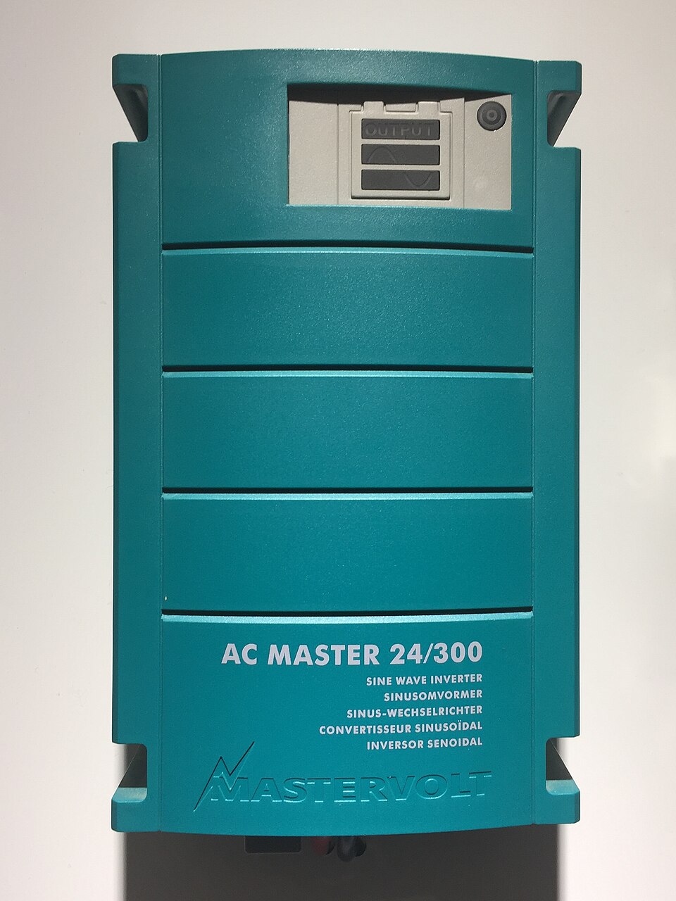
A real Mastervolt AC Master 24/300 sine wave inverter, rated 24 volts in and 300 watts out. The case names it a sine wave inverter in five languages. The OUTPUT panel sits at the top. The efficiency rating is not printed on the front. A buyer reads it from the datasheet, where the load point behind it can be checked.
The big number on a spec sheet is usually the peak efficiency. Peak efficiency is the best the inverter reaches, at one ideal load. The inverter rarely holds that one point on its curve. The peak is the highest figure a maker can show, so the peak is the figure that lands on the box.
The peak reads better than the everyday number. A peak of 95 percent looks stronger than a real average of 90. A buyer lives with the efficiency across the whole day, at every load the device draws. A peak alone leaves the rest of that story out. A buyer who reads only the peak reads one line of a longer page. The full read takes the curve or a weighted figure. The peak says nothing about where it sits. An inverter hits its peak at one load on its curve. The peak number gives no hint of that spread. A spec sheet that lists only a peak leaves the curve unsaid. The load that gives the peak is rarely the load a device draws all day. The gap between the peak load and the real load is where the surprise hides. A light real load can sit well below the peak.
The peak is easy to measure and easy to print. A maker tests the inverter at the load that gives the best number. That one figure goes on the box in large type. The loads below and above the peak rarely appear beside it. A buyer who stops at the peak reads only the inverter’s best moment.
A peak figure still has its place in a quick scan. A higher peak rarely comes from a worse design. The peak gives a fast hint of the inverter’s class. The deeper read comes from the curve or the weighted number. The peak opens the conversation. The curve finishes it. A scan starts with the peak. A choice ends with the weighted figure. A buyer reads the peak first and the weighted figure second.
The efficiency curve
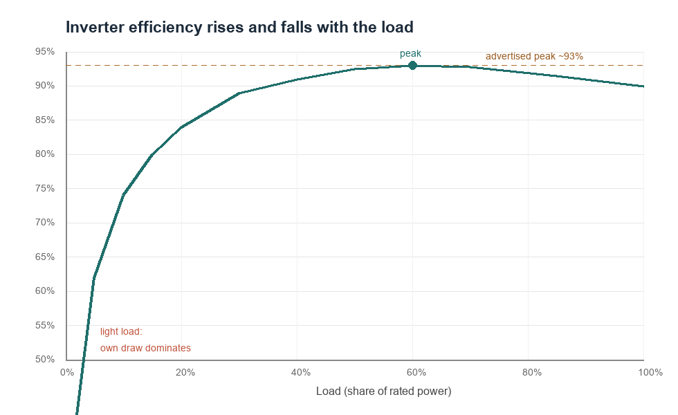
An inverter efficiency curve, drawn to show the shape. Efficiency runs low at a light load, since the inverter own draw is a big share there. It climbs through the middle loads to a peak near 93 percent. It droops a little at full load. The advertised peak is the dashed line. The figures are illustrative.
Efficiency is a curve that changes with the load. The curve runs low at a light load. It climbs through the middle loads to a peak. It droops a little at the heaviest load. The curve is the real picture of the inverter’s efficiency. A line on a graph says more than a number on a box.
The light-load end is low for a clear reason. The inverter draws some power just to run itself. That self-draw stays about the same whether the load is light or heavy. At a light load, the self-draw is a big share of a small total. The efficiency runs low there, because the inverter’s own circuits take a large cut of a light load. A tiny load barely feeds the device past the inverter’s own appetite. The efficiency there can fall well below the peak. A light load is the costly end of the curve for a big inverter.
The peak sits where the inverter runs best. The self-draw becomes a small share once the load is large. The switching and wiring losses stay low through the middle loads. The two effects meet at a peak, often between half and three-quarters of the rated load. That peak is the number the spec sheet shows. The middle of the range is the inverter’s home ground. A load placed there draws its power cleanly. Home ground is where the inverter gives its best for the longest stretch.
The full-load end droops a little. The current is highest at full load. The losses in the switches and wires climb at that high current. The efficiency slips a few points from its peak in a good inverter.
The shape of the curve repeats across nearly every inverter. The left end, at a light load, climbs fast from a low start. A small load shares the input with the inverter’s own draw. Little of a small input reaches the device. The efficiency rises through the middle loads toward the peak. The middle of the curve is broad and high. Across a wide band of loads, often from a quarter to three-quarters of rated power, the efficiency sits near its best. This broad band is where a well-matched inverter spends its hours. The right end, at full load, eases down a little. The heavy current at full load raises the losses in the switches and the wires. The drop stays gentle in a good inverter. The whole curve tells a buyer where an inverter runs at its best. A load near the broad middle draws power at the inverter’s best efficiency. The peak is one point on this curve, at the top. The everyday efficiency is the part of the curve the load sits on. A spec sheet that prints the curve, or a set of named load points, hands the buyer the whole shape. A reader who pictures the curve reads the peak in its place, as the top of a hill the inverter climbs and descends with the load. Every load the inverter runs sits somewhere on that hill. The broad middle is the place to keep the load. A load parked in that middle runs at the inverter’s best efficiency. The curve holds its shape from one inverter to the next. The peak and the band shift with the design. A reading at any load on the curve is the true efficiency at that load. The whole curve is the inverter’s full report on itself.
Weighted efficiency, a fairer number
A weighted efficiency captures the curve in one number. One reference describes the CEC and European ratings as a weighted average efficiency across a range of typical operating conditions and power levels. The weighting puts more weight on the common loads, the ones an inverter runs at for hours. A weighted number sits below the peak, closer to the day-to-day average. The weighted figure is the curve folded into one honest number. It carries the busy loads inside it. The one weighted figure does the averaging for the buyer. No mental math is left to do.
The CEC weighting leans on the busy load points. It samples the efficiency at six loads, from a tenth of rated power up to full. It puts the heaviest weight near three-quarters of the rated load, where many inverters spend their hours. The light and the full loads carry a small share of the weight. The result is a number that tracks real use better than the peak. The weights came from real operating hours. A buyer inherits that real-world tuning in the one figure. The standard did the weighting once for everyone. The buyer reads the result.
A buyer reads the weighted number as the honest one. A peak of 93 and a weighted figure of 91 can describe the same inverter, the best case and the everyday case in two numbers. The weighted figure is the one to compare across models. The table sets a sample curve and its weights side by side. The numbers in the table multiply out to the weighted figure. The heavy weight at three-quarters load pulls the average toward that point. The weighted figure lands where the inverter does its real work.
The European efficiency is a close cousin of the CEC number. It uses the same idea, a weighted average across loads, with weights tuned to European conditions. The two land near each other for a given inverter. A spec sheet may print either one. Either weighted figure beats a bare peak for judging real performance.
A weighted number works like a grade average. A grade average smooths the luck out of any single test score. The weighted efficiency averages the inverter across its loads. The one figure earns more trust than any single point. The grade average and the weighted efficiency share the same logic. Both smooth out the luck of a single reading. One number, well weighted, beats a dozen scattered points.
A sample efficiency curve and its CEC weights (peak 93%, weighted near 91%)
Load
Efficiency
CEC weight
10%
74%
0.04
20%
84%
0.05
30%
89%
0.12
50%
92%
0.21
75%
93%
0.53
100%
90%
0.05
The power an inverter keeps for itself
Every inverter draws some power to run itself. The controller, the cooling, and the idle switching all take a small, steady draw. This no-load draw runs from a few watts up to tens of watts, by the size of the inverter. It sets the floor under the efficiency curve, since it is pure loss at a light load. The no-load draw is the reason a big inverter wastes power running a tiny load. The self-draw is a fixed cost the inverter pays to stay on. A big inverter pays a bigger fixed cost. The fixed cost stands out at a light load. The inverter’s own draw never sleeps once it is on. That steady draw is the first watt the battery spends. The inverter pays that draw the moment it switches on. The draw stays steady from the moment of power-on.
What efficiency costs at the battery
Efficiency turns straight into battery draw. A device needs its watts no matter the inverter. The inverter adds its loss on top, drawn from the battery. A 90-percent inverter draws about 11 percent more from the battery than the device needs. A 95-percent inverter draws about 5 percent more. The lower number costs more battery for the same work.
A gap that looks small at a glance adds up over a long run. A 5000-watt inverter at 90 percent draws about 5560 watts from the battery at full load. That is near 300 watts more than the same inverter would draw at 95 percent. The 300-watt gap runs the whole time the load is on. Over a long run, that gap is real battery capacity spent on heat. A small percentage on a big inverter is a large number of watts. A bigger load opens a bigger gap. A big load on a low-efficiency inverter wastes a lot. The waste is real watts off the battery. The bigger the inverter, the bigger the watts at stake.
The cost is heaviest where the inverter runs least efficiently. A light load on a big inverter runs at the low end of the curve. The battery there feeds the inverter’s own draw on top of the small load. Matching the inverter size to the usual load keeps it on the efficient part of the curve. A right-sized inverter spends less of the battery on its own losses. A right-sized inverter is an efficient inverter in practice. The size match does as much as a high peak. The size of the inverter is a choice the buyer fully controls. A matched size is the surest way onto the efficient part of the curve.
Efficiency is one piece of the runtime picture. The battery capacity, the load, and the efficiency together set how long a system runs. A higher efficiency stretches the runtime for a given battery. The efficiency rating is the part a buyer reads off the inverter. The battery and the load fill in the rest.
A worked day shows the cost in real terms. A 1000-watt load runs for eight hours on an inverter. At 90 percent, the inverter draws about 8900 watt-hours from the battery over the day. That is near 500 watt-hours more than the same job would take at 95 percent. The gap is a slice of battery spent on the inverter’s heat. A higher efficiency hands that slice back to the runtime.
The cost scales with the hours of use. A pack run hard for hours a day shows the gap plainly. The efficiency weighs heaviest on a system that works long shifts. A light, brief load barely feels the difference.
Efficiency is a slice taken from every watt-hour.
Reading an efficiency claim honestly
A spec sheet rewards a careful read. A buyer looks for a weighted efficiency, or the efficiency listed at named loads. The weighted figure is the one to trust across models. A bare peak with no load point behind it tells little on its own. The bold number on the front is only the start of the read. The careful read moves past the headline to the load points. The weighted figure waits a line or two down, where the honest figure lives.
The load point behind a number is the key. An efficiency means nothing without the load it was measured at. A figure given with its load, like 93 percent at half load, is a real claim. A buyer asks one question of any efficiency number: at what load. A number with no load behind it answers nothing. A number floats free without its load. The load anchors it to a real claim. The load is the anchor that gives the percentage its meaning.
A weighted figure already answers that question. The CEC or European number bakes the load points into one figure. A buyer can compare two weighted numbers straight across. The weighted figure carries its loads inside it. That makes it the fairest number for a quick comparison. A buyer lines up the weighted numbers and reads them straight. No load lookup is needed for that compare. The weighted figure is ready to compare on sight. A buyer lines up the weighted numbers and reads them straight. No load lookup is needed for that compare. The weighted figure is ready to compare on sight. A buyer reads it once and moves on.
Mistakes with the efficiency rating
A few mistakes follow from the efficiency number. The first is trusting the peak as the everyday figure. The peak sits at one ideal load. A buyer who plans around the peak plans around a number the inverter rarely holds. The weighted figure is the safer base for a plan. A plan built on the weighted figure holds up in daily use. The everyday load is what the plan has to cover. A plan that covers the everyday load covers the real need. The everyday figure is the one to size against. A plan that covers the everyday load covers the real need. The everyday figure is the one to size against. The plan rests on the load the inverter meets each day.
The second is ignoring the load point. A 96-percent claim with no load behind it can hide a poor light-load curve. The number means something only with its load named. A buyer reads the load point before the percentage.
The third is buying a big inverter for a small load. A 5000-watt inverter run at 200 watts sits at the low end of its curve. The battery feeds the inverter’s own draw on top of the small load. A size matched to the usual load runs on the efficient part of the curve. The right size saves more than a high peak does. The load decides where the inverter sits on its curve. A matched load keeps it high on the curve. The load and the size together decide the real efficiency.
The fourth is comparing a peak to a weighted number. Two inverters can look close at 95 and 94 percent. The two numbers may be of two different kinds, a peak and a weighted average. A fair compare puts the same kind of number against the same kind. A peak belongs next to a peak.
The fifth is forgetting that the loss is heat in the room. The watts an inverter loses leave as heat from its case. A low-efficiency inverter under a heavy load warms the space around it. The heat is the same power the battery spent for nothing. A high efficiency keeps that waste, and that heat, low. The wasted watts warm the room and drain the battery at once. A high efficiency cuts both at the source. Less heat and more runtime come from the same gain. The two payoffs arrive together with a higher rating. Less heat and more runtime come from the same gain. A higher rating quietly improves both at once.
The sixth is reading efficiency without the rest of the sheet. The efficiency is one number on a long spec. The wave type, the surge rating, and the no-load draw sit beside it. A buyer who reads the whole sheet reads the efficiency in context. The single number is one trait among several that make a good inverter. The efficiency reads best alongside the rest of the spec sheet.
The seventh is mixing the inverter’s efficiency with the charger’s. A system charges the battery, then discharges it through the inverter. Each step keeps its own efficiency. The round trip multiplies the two together. A buyer who counts only the inverter misses the loss on the way in. The charge step and the discharge step each take a cut. The battery loses a little at both ends of its day. The full system efficiency runs lower than the inverter figure alone. The round-trip number is the one a long plan leans on.
Common questions
What does inverter efficiency mean?
Efficiency is the output power divided by the input power, written as a percentage. A 90-percent inverter turns 1000 watts from the battery into 900 watts at the device. The other 100 watts leaves as heat. A higher efficiency leaves more of the battery for the device.
Is the peak efficiency the real efficiency?
No. The peak is the best the inverter reaches, at one ideal load. The efficiency runs lower at a light load and slips a little at full load. A weighted figure, like the CEC or European rating, averages the loads into a fairer number. The peak alone overstates the everyday efficiency.
What is a good inverter efficiency?
A good pure sine inverter peaks near 90 to 95 percent. Its weighted figure sits a few points below the peak. The number to compare is the weighted one, at a named load. A figure with no load behind it tells little.
How does efficiency affect battery runtime?
A lower efficiency draws more from the battery for the same output, so the runtime is shorter. A 90-percent inverter draws about 11 percent more than the device needs. Raising the efficiency to 95 percent cuts that extra by about half. The efficiency is one part of the runtime, alongside the battery size and the load.